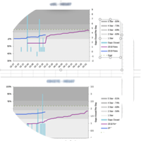
2012-2018 Populations By Star Ratings
We know that the overall share of membership is shifting towards higher rated plans. Here we show the scores 3 ways to help tease out whether this is due to growth and consolidation into higher rated plans versus organic improvement.
In a prior blog post, we graphed membership by the Star rating. We define “Star Rating Population” as the membership during the year that the ratings apply to. (except for 2018 Star ratings since 2018 is not started yet) Here are two other graphs – the rating by the incurred year population (the year that services actually occurred) and the population by measurement year – the year in between incurred and Stars while the scores are gathered by CMS.
There are about 5% more members in 4 Stars plans by Star year versus the incurred year. This reflects both plan growth and the consolidation especially by the national companies where membership from lower rated plans has rolled into the higher.


