Medication Adherence Cutpoint Trend Analysis
Medication Adherence Cutpoint Trend Analysis


The first nine graphs outline the medication adherence measures from 2016-2018 by number of contracts at each score overlaid with star cutpoints. As you scroll down (to the present), it becomes noticeable plans that scored lower in 2016, such as one plan in Puerto Rico, are moving towards the median (highlighted in green). There are two effects of this shift. First, by bringing up the tail of the one star range, it pushes up all of the cutpoints. Second, it raises the mean, resulting in more contracts falling below it. but what's not obvious from these images is whether the non-outliers are improving.
Here are some other visualizations to help answer this question.
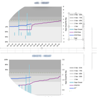
Cholesterol


The first graph shows the percentage of plans at each score for each year for Cholesterol. The second graph illustrates the cumulative percentage of plans by score. Now we can clearly see that these various measures are improving each year. The same holds true for the other two medication adherence measures shown below.